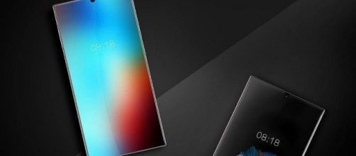
Sharp Mobile was in the news last week when the OEM's General Manager of the mobile phone unit in China shared an image of the company's yet-to-be launched bezelless smartphone. The image of the Sharp bezelless smartphone exhibited an uncanny similarity with the Essential PH-1. Although the Sharp handset's image was also similar to the very first image of the Essential Phone, a new image has surfaced online now, which suggests that all may not be what it seems.
Is the impending Sharp smartphone not bezelless?
A new image of the Sharp smartphone has surfaced, which tells a different story from what we saw in the previously leaked images.
The new images were posted by Luo Zhongsheng, the vice president of Foxconn, the iPhone assembling firm. The images shared by Zhongsheng show several smartphone units undergoing the testing process in the factory. The Foxconn VP claims that the smartphone units shown in the picture are the prototypes of the new Sharp handset whose pictures were leaked last week.
However, the design of the smartphone in the photo shared by Zhongsheng is quite different from the previously leaked pictures shared on the internet by the general manager of Sharp Mobile. While the images from the GM showed the handset as bezelless, the latest leak shows otherwise. The images show the device sporting moderately-sized side bezels and relatively thicker top and bottom bezels.
However, the top bezel is smaller than what most smartphones in the market come with. More so the top bezel of the new Sharp handset shown in the latest leaked image is narrow enough to invite comparisons with Samsung's Galaxy S8.
Smartphone images show thick black bar at the bottom
The new images of the Sharp smartphone hold no similarity with the Essential Phone from any angle. However, what draws the attention to the device is not the top or side bezels, but the bottom one. In the image shared by the Foxconn VP, one can clearly see a thick Black Bar below the on-screen navigation and home buttons on the handset. On detailed scrutiny, it can be deduced that the bar is a part of the screen and, not only ruins the purpose of on-screen buttons but is also a waste of space. Not only that, it ruins the overall design and aesthetic of the smartphone, given that consumers are now used to seeing Samsung's minimum bezel Infinity Display smartphone Galaxy S8.


