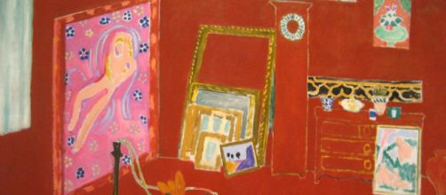
It looks like a bad sunburn – Matisse’s monochrome painting "The Red Studio" – now making headlines in an exhibit at MoMA.
"The immersive thrill of Matisse’s 'The Red Studio'" was the screamer in The New Yorker magazine. "Absolutely enthralling" was the banner at the Guardian. The Financial Times called it "stunning."
Size matters
Being red all over is an attention-getter, yes. But surely the size of this thing is a factor. Six feet tall and seven feet wide and all in lobster red is enough to stun anyone.
Yet, this work didn’t stun anyone when it first appeared in 1911.
It just baffled people. Monochrome painting was unheard of back then. “The Red Studio” was viewed as so off-beat that even the man who commissioned it – Russian collector Sergei Shchukin – rejected it.
MoMA says “The Red Studio” was the start of modernism. In its exhibit literature, the museum classed it as a "foundational work of modern art." The Guardian calls it "a game-changer," adding that it took "creative courage" to try something so new.
But wait. Isn’t there something else unusual about "The Red Studio"? Look again. Matisse pictured his workplace without foreground or background. Without depth, it’s flat, with only fractional indicators of near and far. Now, that’s modern!
Since the Renaissance, painters sought to create the allusion to distance, either with light and shade, overlapping, and or one-point perspective, where things are made smaller to give the impression of receding in the distance.
Even in later centuries like the revolutionary Impressionism, there was an allusion to depth.
Something is missing
I’d go so far as to say that the color in "The Red Studio" is irrelevant. It’s the lack of any allusion to the third dimension that distinguishes it. The Guardian gave a nod to this lack of dimension, saying that it was only after WWII that artists started painting flat abstract pictures, such as those by Mark Rothko and Ellsworth Kelly.
I would have given more than a nod since it was that utter lack of depth that started the modern movements. Clearly, color isn’t everything, even despite The New Yorker swooning over it, exclaiming; "Gorgeous? Oh, yeah. Aesthetic bliss."
To be fair, after the magazine’s initial gushing, it gets around to noting the lack of depth: "There’s no possibility of entering the portrayed corner space, even by way of imagination."
It’s also possible that "The Red Studio" isn’t all that forward-thinking given what the Russian collector commissioned Matisse to do – something decorative, he said.
Shchukin was a textile merchant.
Explaining why he rejected "The Red Studio," Shchukin told Matisse he only liked pictures with people in them. You’d think that would have been a cinch for the painter. In his Notes d’un Peintre, he wrote: "What interests me most is neither still life nor landscape but the human figure. It is through it that I best succeed in expressing the nearly religious feeling that I have towards life..."
Meanwhile, MoMA quotes Matisse admitting that he didn’t know what he was thinking when he painted "The Red Studio." Sometimes I think that painters should stick to painting and not say anything.


