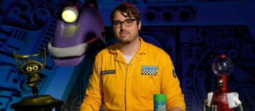
From the start, "Mystery Science Theater 3000: The Return" appears to ignore its theme song, which features the words "it's just a show, I should just relax." Instead, it seems to try to give the backstory its prolog by actually demonstrating how the new guy Jonah gets trapped in this series. The original run of the series, despite trading Writer Joel Hodgson for Director Mike Nelson as the one stranded, never really needed this intro. It was all covered in the intro theme, never even bothering to explain why the hosts swapped aside from giving us different stories.
Though the old writing advice goes "show, don't tell," this showing wasn't necessary and just seemed to eat up screen time before finally getting to what the audience was waiting for. Someone should have told the writers to "just relax" as the theme song suggests.
The robot roll call is back, but it doesn't look like anyone else is
Some of the old cast is back, namely the robots, while in the first episode, it seems to try entirely too hard to be modern. When Jonah breaks down into a rap about monsters, it suddenly feels like you walked in on a bad school play set up by Disney. It isn't funny when it seems like the show is trying to be educational.
Thankfully, the humor is still there where it counts.
Tom Servo (Kevin Murphy), Crow (now voiced by Bill Corbett), Gypsy, and Cam-Bot make their return as wisecracking sidekicks, and it seems the humor is a touch wittier this time. I could have done without the floating Tom Servo, and the ceiling mounted Gypsy adding to the silhouettes. It's a little distracting when they exit their usual places. Also, at least in the first episode, it seems like Cam-Bot only gets a mention and is never seen again.
The visuals of 'MST3K: The Return' seem unnecessarily updated
Also updated is the transition animation where we go from Jonah and the robots indulging in their usual break-time shenanigans to commentating on yet another bad movie. Instead of almost garishly over-colored doors, we now get what looks a bit more like the hallway out of "Get Smart," with the doors closing around mechanical versions of the numbers.
While we can see the figures more clearly now, it doesn't feel right.
The problem with these updated visuals is that they take away from the cheesy camp which older fans grew to love about the original series. It went from a set they probably paid maybe $500 for to a bunch of CG effects, and the effect is a kind of disconnect with what we were used to. The low-budget look was part of the charm.
What do you think of the new Netflix series?

