An old principle in architecture – form follows function - that calls for buildings to reflect the goings-on within them. Nowadays, that’s horse and buggy talk. And when it comes to museum architecture in our lifetimes, it’s as if the principle never existed.
Remembrance of things past
You have only to conjure up Frank Lloyd Wright’s Guggenheim Museum, which looks like a spaceship that crash-landed on Fifth Avenue, to know the form-follows-function principle, coined by American architect Louis Sullivan in the 19th century, is a thing of the past.
Screaming for attention
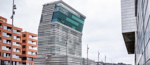
The latest building that disses the principle is the 13-story Munch Museum in Oslo, which opens in August.
Designed by architect Estudio Herreros, it pitches forward on the upper floors like a very tall person stopping to say hello to a concise person. In other words, the form of the building has nothing to do with its function – a display of Edvard Munch's agonized imagery like The Scream.
Architectural Digest magazine calls the museum’s form “striking.” The topside bend gets a mention as “cranked.” Much more is made instead of its state-of-the-art features such as energy efficiency, natural ventilation of 11 exhibition halls of different heights and sizes, and an exterior of recycled aluminium.
Point counterpoint
The Oslo Travel Guide observed that the tallish Munch museum offers a counterpoint to the nearby horizontally oriented Oslo Opera House.
Due to its “characteristic leaning top section, the museum has become a distinctive Oslo landmark.”
Go quirky
There’s that word again – “landmark.” Isn’t that what the Daily Mail said of Frank Gehry’s 977-f00t-tall Toronto towers - “an instant landmark”? Apparently, that’s the way to reach landmark status in architecture these days – go quirky.
I’m thinking of the Basket Building in Newark, Ohio, which looks exactly how it sounds, except its seven stories high. At least, the form follows function. The building houses a basket manufacturer.
Reliving the nightmare
By the look of the Munch Museum, you’d never guess that it housed Munch's despairing picture-making – the result of illnesses that plagued his boyhood.
His picture titles tell the story. The Sick Child, for example, came out of the death of his sister from TB.
Another picture title, Vampire, is more of the same grimness with a long-haired woman colored red that resembles dripping blood. Also in this picture is a male burying his head in the woman’s lap, likely Munch himself suffering the sickness around him. Then there’s his Portrait in Hell, a selfie showing his face made blood-red by an inferno in which he lives.
Saying hello
For the most part, Munch’s figures look uneasy as if to underscore his angst. The Scream sums it all up. Of course, it may be argued that such unease is reflected in the museum’s façade because the upper stories bend.
But the way I see it, the bend is more a greeting than grief.
Given that the museum is used to display Munch's work, not only does the building’s form not follow function, it’s sidelined at the curb. As for that genial bend of the museum’s upper floors, it’s more fitting for a Disneyworld hotel.
One more thing
I’m not sure what the architect could have done to signify the museum houses Munch’s work. But making it quirky, isn’t it. Munch suffered disquiet, but he wasn’t abnormal.


